The 3 primary/basic/pure colours are Red, Yellow and Blue. If you mix two of the three primary colours, you get a secundary colour - and the third colour, the one which is not used in that mix, is its complementary colour. See also the triangle:

Red vs Green = Red vs (Yellow + Blue); Yellow vs Purple = Yellow vs (Blue + Red); Blue vs Orange = Blue vs (Yellow + Red)...

NB - In watercolours, adding a complimentary colour as a shadow, works like a warm organic grey tone, much less 'hard' than, say, Payne's Grey, or black.
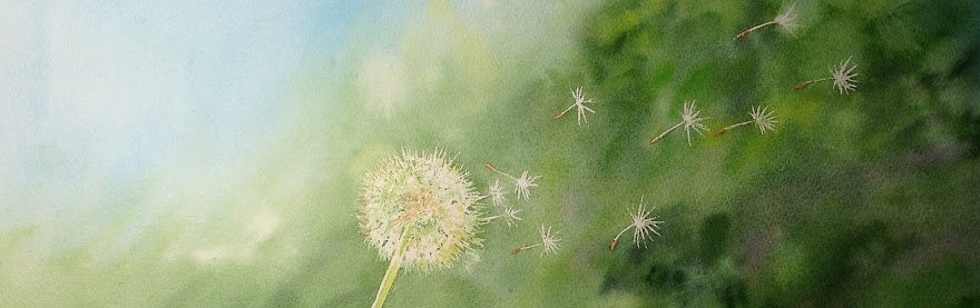
The Aquarellistas got their inspiration out of the complementaries - and it worked so well for them... have look at the results!

Sylvie D. is back from her travels and used green vs red for this very Magic Mushroom...

Red vs green for Sheila who had a good struggle but ended up creating this!

Complementary at its best!! Elia's frog, epoustouflant!!!

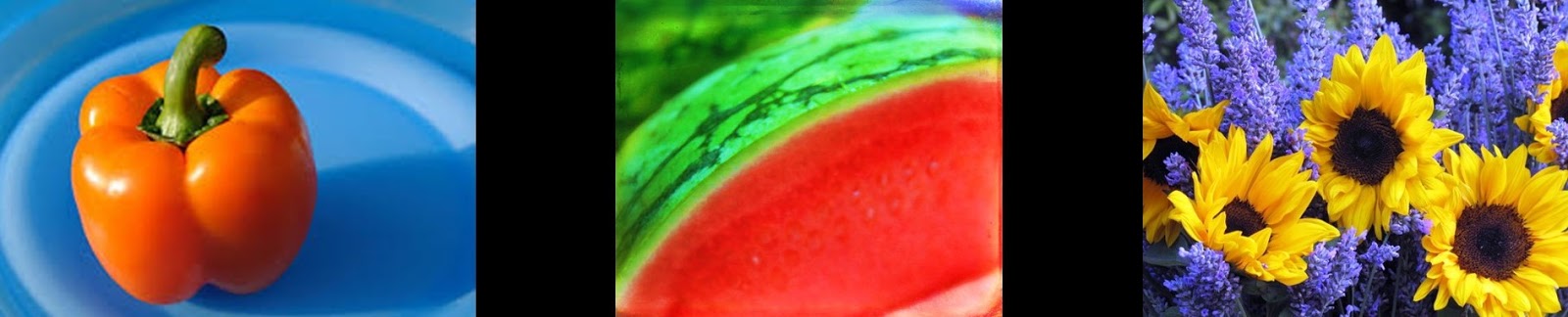
Have to post these two, although not finished, by Liz - my fav complementary combi Orange & blue... SO Liz!


The only purple-yellow combination, by Marie-Claire - not completely finished yet already working as a splashing contrast

Brigitte started this huge red pepper, it is recognizable as a shape but wait until there are lots of complementary green around it - how exciting!
There was also a lot of time and effort into other watercolours, I will post about them later...
No comments:
Post a Comment
your remarks and observations to a post are most welcome! Please start typing here :)