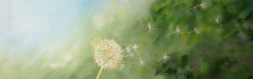
Saturday, 2 February 2013

Stretching paper

It's been some time since I posted! I've been so busy - with painting, commissions, free work and partying in the Riviera sunshine!! By the way, if you are interested in regular posts about watercolours, I also write on the 'Hangar Blog', short stories with lots of pictures of my painting group. Have a look on http://www.hangarart.blogspot.com!
 
Below are a couple of pictures in which I stretch my paper. Our Aquarellista team has been watching a film about a Polish artist living in France (Ewa Karpinska, more about her later) who works super-wet in super-wet. It was interesting in many respects, one of them that she stretches her wet paper around frames (like linen) with staples. That looks wonderful and I was considering it - but took that back when I decided to use the frame of an old oïl painting: to remove the staples out of the frame was a hell of a job, so what if you have to do that every time when you muck up a painting? Or just every time when you are finished... and you can't let the staples in because after a while it will be all metal... I decided that that way is suitable for very very big paintings or for very carefully planned projects where it is not expected that anything will go wrong

Alexander Cresswell -more about him later- staples his 3m paintings to some sort of table

So 'my' method, stretching to a board with paper tape is no less efficient, especially if you want to experiment, or when there's a big chance that things go wrong, or if you stretch for groups, like me... Here's how I do it:

The (still wrapped) roll of Arches Torchon paper, 1.13m wide and 9m long... 
...paper unwrapped and ready to be cut...
 
 ...sheets straightened, soaking in the tub with cold water...
...sheets hanging...

...cut to size...

...press out the water and stretch at the same time... 
...cut the sticky paper tape... 
 ...one paper stretched...

...boards with stretched paper drying...
 
See the Hangar Blog to check out what's done with them :)

Monday, 12 November 2012

A Portrait Challenge

A Portrait Challenge...
 
In a recent issue of the magazine 'L'Aquarelle', in the Help section, where enthusiasts can ask the professionals for help to improve their paintings, this time a Canadian lady Marian Ouchi asked for help with a portrait she created.
 
As you all can see, the portrait is not bad, but a bit light and it could use some contrast. And it is (I think) a nice exercise for all aquarellistas to give this a try. An extra incentive should be the 'advice' the magazine gives.

This is no solution, it is ruining the picture...and I realize, Marian Ouchi sent her portrait on photopaper, and you cannot paint well on photo paper, but hey, you can scan a picture! Well anyway, some of our group found it an interesting project and gave it a try - more will follow I'm sure and we'll send the best ones to the magazine, so if you would like to give it a try too... by all means go ahead and send me your picture! I will make sure it ends up with the l'Aquarelle redaction.


NB: don't get me wrong, l'Aquarelle is a great and inspiring magazine, that I have a long term subscription to ☺

Tuesday, 5 June 2012

Aquarelle 'Big Rose' on Artbag for Stop Aids Now

Every year, a Dutch well known artist makes a design for 'the Artbag'. The Artbag is a shopping bag which is produced and sold in high volumes. The proceeds go to 'Stop Aids Now!', an organisation which fights aids in third world countries and especially focuses on women, adolescents and children. This year, Marina Kulik has created the design - a big, multi colour rose, in aquarelle watercolours on handmade paper...

"As soon as I saw the announcement, I uploaded my Big Rose design. First of all because it was for Stop Aids Now and that is a cause I deeply feel for. Also because I love it when my work can have additional value. And because I always buy the Artbag myself (for the good cause and because they are so handy!) And last but not least because it is fun to participate in a contest - especially when it is with a jury!
After I sent the image I found out that others needed to vote for it via facebook, and that a jury was going to select the winner from the Top Ten... So I have started a big time spamming campaign - and that really has worked! Big Rose ended up safely in the Top 10, together with plenty of other good and original designs! I didn't count on anything, but the jury has - after 4 days of deliberating- chosen my design!!

I am superglad and proud, and I cannot wait to see the bag in real life! The most rewarding for me is that I can really contribute to Stop Aids Now!"

Order the bag and support Stop Aids Now? http://www.stopaidsnow.nl/ or get in touch with me via the comments below or my website www.marinakulik.com

Price of the bag: 5€

Saturday, 12 May 2012

Watercolour of Vincent van Gogh

Did you know that even Vincent van Gogh was an aquarellista in his early days!
Everyone knows him from his poetic yet tortured impressions in oil - but in his early period he worked in watercolours!
The Van Gogh Museum in Amsterdam just added this one to their collection:

Picture credits to AP Photo/Van Gogh Museum.
Mike Corder, Associated Press

It is from 1882, he was 29 years old and still working hard on getting the perspective right. At the time he was mostly working in black and white sketches. I personally think is it quite muddy - but you probably have to take into account that it is painted in Holland, where the skies are grey. And the light, around the willow and in the sky, with the blue patches, is very good. Enlarge the picture by clicking it. It seems that Vincent was happy with it:
He wrote about it in a letter to his brother Theo and that letter is now displayed next to the aquarelle in the museum. He writes that he thinks this is one of the best of a series of watercolours he painted that summer...

I tried to find more watercolours by van Gogh on the internet but gave up as hundreds of watercolours by amateurs 'after van Gogh' showed up. Some were very well done - good for you guys! Keep working on those aquarelles! Below one that seemed authentic to me, great strong colours,  most certainly done in watercolours (with cauliflowers to prove that) and I guess ink for the outlines and the masts:

Boats at Saintes Marie

Wednesday, 18 April 2012

Cool Book!

My friend and colleague artist Mariette du Maine has a French name, yet is Dutch, and lives in Holland but travels to France whenever she can. And when she's there she makes the most wonderful atmospheric watercolour sketches you can imagine. I have written about her before, check that out here.

Impression of fall with Potimarrons

In February she went to Aix-en-Provence. It was cold and beautiful, and as always Mariette created a 'Carnet de Voyage' that is now available as a book. And it is COOL! I love it...

http://onlinefotoalbum.hema.nl/onlinefotoalbum-bekijken/cc306f00-286b-4d34-84f6-019104976679

It is in dutch and french - but even if you don't speak that, the pictures will tell the story...


Wednesday, 11 April 2012

Did sunlight damage my test painting?

The first year test results...
When you buy -or paint- a beautiful aquarelle watercolour that you would like to have on your wall, you have to put it behind glass to protect it from dirt and humidity. Also, better not put it in direct sunlight, because that's asking for fading. The beauty of aquarelle is in the subtlety and the transparency - and that would be what you lose when it 'fades'.


Nowadays you can buy varnish for watercolours, that claims to be protecting the painting from 'light' damage. I have one of the brand Schmincke and tested it a couple of times and it doesn't visibly change the watercolour. It made it somewhat waterproof, but not quite enough (more about that in a future post). But will it protect the painting against bright light? I use Winsor and Newton artist quality aquarelle paint and Arches acid free cotton paper that also claim to be perfectly light resistant...
Time for a test!

A year ago, I painted 9 colours that I often use (Payne's grey, Sap green, Sepia, Crimson, Ultramarine, Lemon, Winsor Blue, Winsor Red and Winsor Orange) on a sheet of Arches Torchon 300grs watercolour paper.
I cut the paper in 3, put one part in a binder (with absolutely no light). One other piece I varnished, and then put that up together with an untreated one, in a window of my atelier, on which the sun shines all day (remember I am in the South of France...)


Today, a year later, I took them off the window and put them together again:

The photo is a bit blue and vague - but you can see that there is no difference. The top part is varnished, the middle part was in the binder and the lower part is completely untreated.
Not much to conclude yet, but for sure, one year in the bright sun can be handled by W&N on Arches without varnish!

They are back in the binder/on the atelier window, more next year!

Thursday, 8 March 2012

Bibbi's portrait - a wonderful struggle

In December 2011 Aquarellista Britt-Marie Isaksson left the South of France to go back to her homecountry Sweden... Bibbi is a wonderful artist, with an outstanding technique and amazing imagination. Before they left, her husband asked me to paint her portrait and Bibbi later asked if I would make sure there were 'Marina things' in it...
It had to be a 'reconstruction' portrait - Bibbi didn't 'sit' for me and wasn't there to be sketched or just checked if I was doing right, but I had a couple of pictures to help me - and of course I know Bibbi and of course I have an image in my head that I wanted to paint: that of a lively woman, with a warm and comforting smile, a great artistic talent and a colourful fantasy.
In the photographs I had were no 'usable' hands - so when I had decided on the pose, I took a picture of my own hand and used that...

And there was another challenge: if I paint a portrait, I really 'dive' into that person and whilst painting, I often 'become' that person. What I didn't realize was that painting a colleague-artist, meant that I kept adopting her style! It was really difficult to paint Bibbi and not paint like her... And more than once I thought, I'll start with a new one. But putting it aside for a week helped me get a fresh look on it and in the end it all worked out fine. I am happy with the result - and luckily, so are the new owners!

Monday, 5 March 2012

Graphical Nudes - results

My aquarelle class has been working on nudes, combined with reflection and shadow and the results are so spectacular that I'd like to share three of them with you. They worked from small sixties black and white photographs which they enlarged and then used to create different and interesting atmospheres in their paintings:
Cathie van der Stel 
(created a metallic shine and used salt)

Sandra Seymour-Dale
(likes to incorporate handwriting)


Liz Douglas
(based on the same picture as Cathie but a horizontal approach)

Friday, 24 February 2012

Using the forbidden colour

'White' in aquarelle watercolours - why does it exist?

From the first time I started working with aquarelle I learned that using white paint in aquarelle watercolours is 'not done', for the simple reason that there is no need for white! White is the lightest colour in your painting, you are working with transparent paint and every painted part is darker than your paper. So when you need the lightest colour don't paint that part, leave it the colour of your paper. This must sound familiar to you aquarellistas out there!
From light to dark the purist way

It is what I teach in my watercolour class and what I've always practised. The only question is, why does white aquarelle paint exist then? It is transparent and doesn't help covering or repair mistakes...

It set me thinking and I have now found at least one good and purist aquarelle use for transparent white:
As you probably know, the best way to go from dark to light in an object in aquarelle, is to start with the lightest colour. (In other words, start with the thinnest paint, the shade with the least pigment or the most water). If you start with the darker tone (with the highest amount of pigment in it or the least amount of water), and add a thinner paint, you get the famous 'cauliflowers' effect! (This can be very beautiful - but it is not always what you want). 
Cauliflower effect

Since the cauliflower effect is caused by the more watery, low on pigment and therefore lighter colour, you can avoid it by making the colour lighter by mixing transparent white through it! 
I used W&N Chinese White in my experiments (and to be honest wasn't deeply impressed) but it did work, and there were no cauliflowers...!
From dark to light using white

For those of you who have thought of using white to cover small mistakes: don't use acrylic paint, it is slightly shiny and stands out. Better use gouache white... they are watercolours too, only opaque... But you don't have this from me!

Monday, 13 February 2012

Transferring (from newspaper to painting)

Somewhere in a book or article I read that certain newspapers are printed with fatty ink that you can transfer to paper. I don't remember which newspapers they were (but certainly not the Nice Matin - that doesn't transfer at all). Colleague Aquarellista Cathie van der Stel and me tried it out - put the newspaper on our work and rubbed it with a spoon - and it didn't give a spectacular result. But nevertheless it inspired us to create something out of it, that was different from what we normally do!

'Ride the wave' it says (mirrored) on this frozen still life by Cathie van der Stel

No idea what this actually is, it just happened after I transferred the header to my paper (It says someting with 'Tiger')(mirrored). The letters were hardly visible, so I traced them with some red paint - and the rest followed. Maybe you have better transferring results with other newspapers, don't hesitate to let me know via 'comments' because it is something I find interesting as a project - for pamphlets or more politically engaged work...

Sunday, 29 January 2012

Exhibition MyDNA aquarelles in Nice


Until 1 February 2012, Marina shows an overview of her latest aquarelles in the hippest gallery of the Côte d’Azur, Galerie Oscar in Nice. The theme of this solo exhibition is ‘the mystery of survival’, referring to DNA, cells, fingerprints, portraits and other unique aspects of life that determine a person’s survival and are omnipresent in Marina’s work. The aquarelles are painted with Winsor and Newton on hand made paper, which absorbs the transparent paint in a different way. This makes the repair of mistakes absolutely impossible, but also makes the colours come out much stronger – an effect I love!
Galerie Oscar is a galerie for contemporary, modern art. They work in an original and different way with their artists and for example regularly have events around the art, with speakers, music and great food. They also organize yoga classes in the mornings and arrange art rentals.
You can visit the exhibition and Galerie Oscar on 9 Rue Fodéré, 06300 NICE
For more information visit http://www.galerieoscar.com

After 1 February the gallery is opened for private viewings, you'll have to contact them if you want to visit


Saturday, 31 December 2011

A VERY HAPPY, VIBRANT & CREATIVE NEW YEAR
TO ALL OF YOU!!

Saturday, 19 November 2011

The Grand Prix d'Aquarelle 2011

McRose 13, Marina Kulik.
90x70 cm, Aquarelle on handmade paper

Out of hundreds of entries, the paintings of Cathie van der Stel, Brenda Moorehouse and myself, were chosen as finalists of the Grand Prix d’Aquarelle. The work is exhibited in The Culture house of Meise until 20 November. Three of our paintings received a honorary mention and I am proud as well as delighted to say that my aquarelle 'Farewell' has won the prize of the Culture Council!

The Grand Prix d’Aquarelle 2011 was an interesting contest, with a theme that Cathie, Brenda and I found appealing: ‘Roses without thorns’. There were strict rules, the work should be made specifically for this Grand Prix, and it was not permitted to show it anywhere else before it was judged. So here they are finally!

Rose without thorns, Cathie van der Stel
50x40cm, aquarelle on torchon

Brenda's Rose without a thorn by Brenda Moorehouse
40x50cm, Aquarelle on torchon

Farewell, Marina Kulik
50x70cm aquarelle on Arche torchon

The title is ‘Farewell’ because I painted it like the roses we dropped in the water of the North Sea, after we scattered the ashes of a dear friend. And it also has as a subtitle  ’Such roses do not exist, but you can hide the thorns’. Hence the ribbon around it. I am very happy with this acknowledgement!

Saturday, 29 October 2011

Gallery commissions - and pricing your Artwork

The other day I ran into an interesting piece by Barbara Joy Smit, Art Agent. Although her article is written from the 'gallery side', I could relate to it and wanted to share it with you (although it is not specifically about aquarelle) because I think it's always good to be reminded that even artists should sometimes think businesslike!
But - the article is in Dutch. Barbara gave me permission to use it anyway - so here's the gist.
And click here for the original article.
  
As you probably know, galleries usually*) ask a commission for every artwork they sell. And often, artists add the amount of the commission to 'their' price.
But maybe that is not such a good idea after all:
A client, who has seen your work in a show, contacts you because he is interested to buy - and likes to know your price, or if you are interested to give a discount. The client comes to you, it is his initiative, so you don't have an obligation towards the gallery... or do you? Or - the client buys a piece in a gallery and later visits your atelier and sees similar work for much lower prices. Or talks to a direct client of you who paid much less... Painful! Won't make anybody feel good.


Now a gallery is a commercial company and they want to make a profit, so they ask a commission. Your own price is probably roughly based on materials and hours, but you haven't included commission because up to now you have sold directly to your clients. If the gallery's percentage is deducted from your price there's not enough left!
Likely your message to the gallery will be: the commission is going to be added.


OK - ask yourself: how much have you invested in marketing to sell your work? What does your work space cost, do you have a website, do you participate in tradeshows, do you have a portfolio, flyers, business cards? These are costs that you have probably paid out of your 'hours'. You have paid for them yourself but it actually makes more (business) sense to make these costs part of the sales price.

As a professional artist you are also an entrepreneur. Look at a loaf of bread you buy, you don't just pay for the ingredients and the baker's salary, there's also a calculation of the bakery's rent, the delivery car, the write-offs of the ovens, the insurance, the accountant etc etc... everything is included in the price of your bread. If a baker does it, why shouldn't you?
You should incorporate your business cost, the money you pay in order to create and sell your work, in your price - and when you outsource the marketing and sales of your work to a gallery, they make these costs. So it's actually logic to give that part to the gallery. Which by the way doesn't mean that you can't negotiate!

When you sell your work through a gallery, you actually hire them, which makes you responsible for the cost. And when a client comes to you, he will pay the same price. No difference where he buys your creation. Do you see the added value of exhibiting in a gallery? Then follow the advice - keep your sales prices the same everywhere!


The world of art is small. Being loyal towards your galleries is very important. Going behind the back of the gallery with one of his clients can really harm your reputation. It may bring in a bit of extra money on the short term, but it can also really damage your relationship with an interesting point of sales...
Of course you can deal with clients yourself. But do the right thing. If the client came through the gallery, contact them and thus build on a worthwhile relationship.


Last but not least, price consistency is easier! If you keep your prices the same everywhere, you create stability in 'your' market and you don't have to keep track, you can put prices on your website and in your flyers. And - it's just more professional.


*) there are also galleries who ask a fixed sum upfront. They are called ‘Vanity Galleries’ because usually they have no selection and everybody can show there, and sales have no influence on their income. Journalists and art critics take these galleries less serious, which doesn’t mean that you cannot use them!