
In last weeks' subject, we studied the transparency of glass, using transparent watercolours, and tried to find solutions to represent the characteristics of hand blown glass, the symmetry, or non-symmetry, the highlights, the different types of blue and the reflection, shadows and background. It was a nice adventure that everyone really enjoyed, we may continue with it next time...

Ingrid painted a wonderful still life with old handmade bottles in different shades of blue, and for contrast a very opaque Delft Blue plate behind it. Great effect!
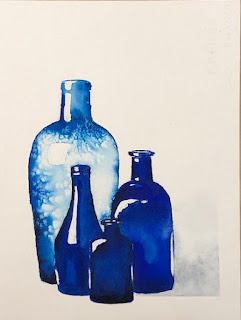
Sonya's choice was this strong still life - and the challenge was in the handmade, thin transparent bottle and the shadow. It is so beautiful, with its contrast and its light - and below you see stage 1 where she had only added some drops of Winsor blue green shade to the watery surface, no salt yet. Leading directly to a fab effect! The salt later finished it off...


Marie did some true research for the properties of a glass bottle. She was very much interested in the lights, the contrasts, the representation of transparency and the exact colour. We were impressed, she was not yet completely happy - but has learned a lot and is going to continue

Sonya also finished last week's green bottles. I am so fond of this painting which is an exercise in shape, light, dark and transparency - and one colour green. And well done too!

Here's another fabulous one, by Thecla. So delicate, spontaneous and undoubtedly glass.I absolutely love everything about it.

And how about this one! So light, transparent and subtle. Painted by Jutta in an elegant and intelligent way.

You may recognise this one, it is based on the same example picture as Sonya's, this version is meticulously painted by Martine, and although the colours are similar, the approach and way of looking is different, as is the light and the shadow . And we have another version:
.jpg)
This watercolour is painted by Sue, you probably recognise the loose style with the splatter. Sue has chosen more transparency and blue shadows.I love the different approaches!
In the meantime... Hard and creative work was done on other paintings too!

Manuela wants to understand roses and started an Andy Warhol series with them! Great looking and she will learn so much from this!!

Judith's painting above was created around 3 oil paint staine on a watercolour paper - she started out with irregular lines around them and then along the whole paper and then added really cool colours. Just playing and it was pretty nice but, well - sorry for the bad picture.
She also painted this sky with warm orange something. There were many interpretations (Dragons' eye, liquid gold, Sauron...) but it is probably just an abstract shape. 😝


After the fantastic glass bottles, Thecla filled a page with soft floating colours. She will doodle on them next week (zentangling)

And Shirley, who was not happy with her blue glass vase, cut it in pieces and stuck it to a piece of black paper. The effect is new and fun and we may see more of it in the near future!
No comments:
Post a Comment
your remarks and observations to a post are most welcome! Please start typing here :)